Monday, December 3, 2012

Color Chart

oil painting color chart due on Friday

Tape Sculptures at Irondale

Tape Sculptures at Irondale!

Wishing Flags


Inspired by the traditional Tibetan Prayer Flag, we will create a positive wishing flag, which will be carved,printed, and hung by the students.
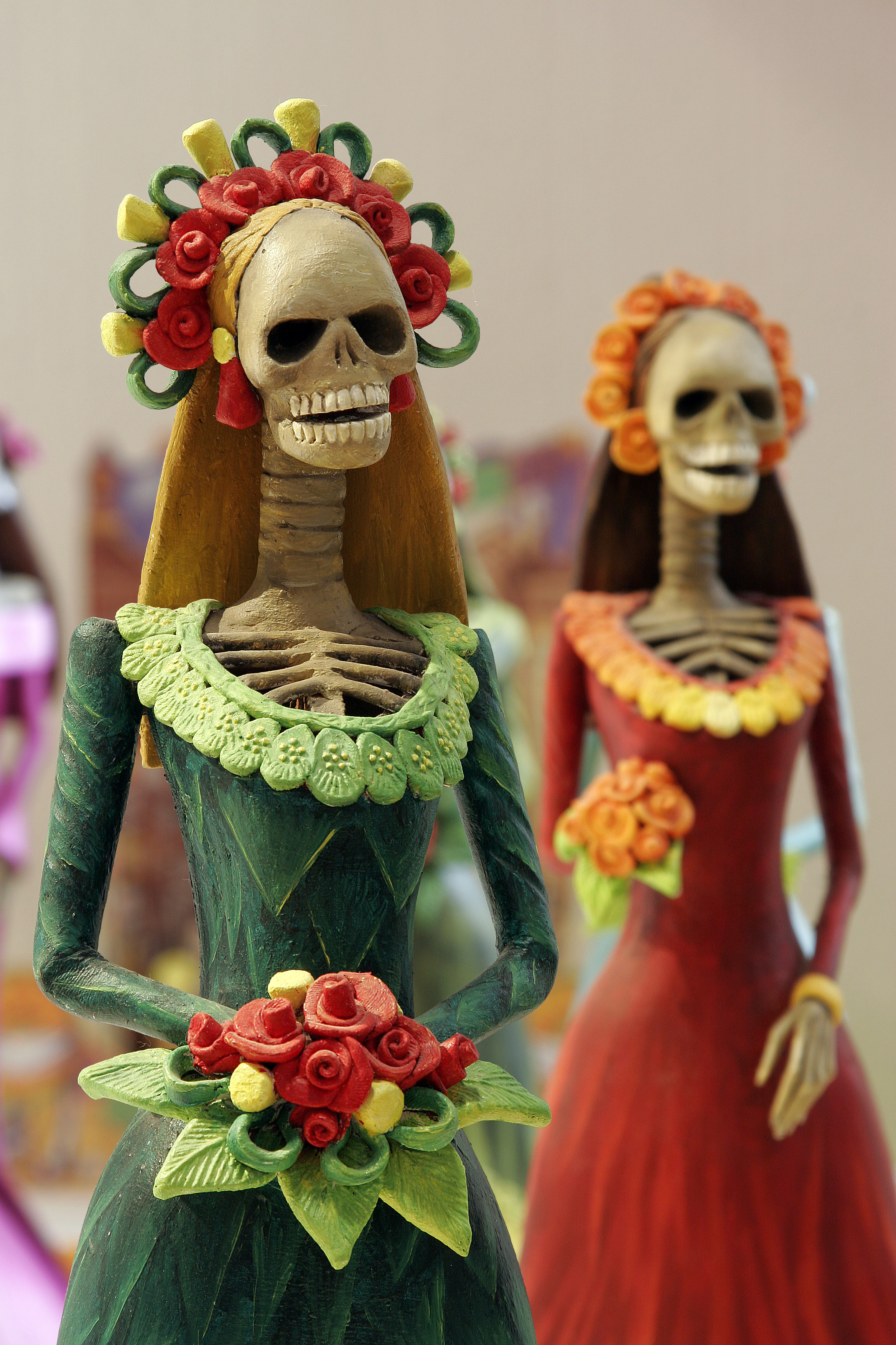
Here are some traditional flags being flown. A common misconception is that these prayers are being sent to the gods. Instead they are positive wishes that are being shared with the community. We will also be creating positive messages to be shared in much the same way.

First, students will brainstorm ideas for images that communicate a positive wish for either themselves or the world. Students will design a central image for their own flag that represents their wish. Finally they will design a border or frame that surrounds the central image. Students can choose to use all images, but could also add text.

Students will transfer their drawings to linoleum and cut it out based on the safety instructions given in class.

Students will use the printing press to make multiple copies of their wishing flags. (The image that students carve will be reversed when it's printed)

Monday, November 12, 2012

Installation Art


Today we'll be looking at this presentation.  

Friday, November 9, 2012

Clay Totem Pots with a Lid

Today we will be starting the walls and the base of our clay project.  First we'll watch a video on how to throw your slab for the walls and base. 

Monday, October 29, 2012

T-shirt design

Today we are starting to work on our stenciled t-shirts.  Here is a presentation showing the process!  Click on the T-shirt Freezer Paper Power Point presentation. We will also watch a youtube video that shows the process.

Wednesday, October 17, 2012

Apple Painting


We'll watch this video today. Every time the instructor in the video says to mix the paint with water, substitute slo-dri. We'll talk about that today too.

Underpainting
Building form by adding Layers
Slo-dri

Final Acrylic Painting

Today you will decide if the color scheme you chose last week is the one you want to use for your final painting.
You need to choose from:
Analogous
Triadic
Complementary
Split-Complementary
Square
Reminders:

  • whichever color scheme you choose, you can add black, white or gray to the colors.  
  • it usually works best to choose one of the colors in your color scheme to focus on and then use the other colors for accents.  
Your assignment starts by repeating shapes or lines with the colors in your color scheme.  Don't let your underpainting show, so use lots of layers.  There will be no white paper showing in the end, so you'll need to fill in the background.  I usually do underpainting on the objects and then underpainting and painting on the background--saving the final coat of paint on the objects for last.  Honestly, this is my personal preference.  I think it's easy.  Make your own path.

Tuesday, October 16, 2012

Basic color schemes


analogous
Analogous color scheme
Analogous color schemes use colors that are next to each other on the color wheel. They usually match well and create serene and comfortable designs.
Analogous color schemes are often found in nature and are harmonious and pleasing to the eye.
Make sure you have enough contrast when choosing an analogous color scheme.
Choose one color to dominate, a second to support. The third color is used (along with black, white or gray) as an accent.

analogous scheme
triadTriadic color scheme 
A triadic color scheme uses colors that are evenly spaced around the color wheel.
Triadic color schemes tend to be quite vibrant, even if you use pale or unsaturated versions of your hues.
To use a triadic harmony successfully, the colors should be carefully balanced - let one color dominate and use the two others for accent.

triadic scheme
split-complementarySplit-Complementary color scheme 
The split-complementary color scheme is a variation of the complementary color scheme. In addition to the base color, it uses the two colors adjacent to its complement.
This color scheme has the same strong visual contrast as the complementary color scheme, but has less tension.
The split-complimentary color scheme is often a good choice for beginners, because it is difficult to mess up.
split-complementary scheme
Rectangle (tetradic) color scheme 
The rectangle or tetradic color scheme uses four colors arranged into two complementary pairs.
This rich color scheme offers plenty of possibilities for variation.
Tetradic color schemes works best if you let one color be dominant.
You should also pay attention to the balance between warm and cool colors in your design.
rectangle scheme
squareSquare color scheme 
The square color scheme is similar to the rectangle, but with all four colors spaced evenly around the color circle.
Square color schemes works best if you let one color be dominant.
You should also pay attention to the balance between warm and cool colors in your design.
square scheme
Complementary colors are really bad for text.

complementary scheme
complementaryComplementary color scheme
Colors that are opposite each other on the color wheel are considered to be complementary colors (example: red and green).
The high contrast of complementary colors creates a vibrant look especially when used at full saturation. This color scheme must be managed well so it is not jarring.
Complementary color schemes are tricky to use in large doses, but work well when you want something to stand out.

Today you'll learn about these different color schemes (and take notes on them) and why it's important to choose one!  Then you'll pick which one you'd like to use for your final painting.  Using your chosen color scheme, you'll paint a quick masterpiece in class today.

Making browns

Students have been experimenting with complimentary colors in order to make mustaches on a stick with a variety of browns.  Our focus is on covering underpainting, recognizing complimentary colors, and working with a variety of brush sizes.  Due today.

color wheel mandala

Students are mixing color wheel mandalas, and are expected to include the true color, a tint, a shade, and also mixed with its compliment.  Due on Wednesday.

Thursday, October 4, 2012

Acrylic Inspiration


color wheel reminder


Papier Mache

I can't imagine working with papier mache without thinking of the festive skulls that are made to celebrate Day of the Dead in Mexico on November 1st.  While there are lots of interpretations of the holiday, I like to think of it as people both celebrating life and the lives of those who aren't still alive.

Wednesday, October 3, 2012

paper mache

For this assignment students are making animal masks, sculpture or taxidermy-like creations mounted on plaques.  The focus is on making a sturdy creation, that is imaginative and well done.

Final Watercolor Painting is due on Monday

Students are still working on their watercolor paintings.  There are so many awesome pieces of artwork in my room right now.  This is the first one completed.  Students need to choose 5 of the techniques learned earlier in the semester that would compliment their work. 

Acrylic Painting

This is what direction we'll go after our starbursts are completed.  Intermediate colors in the first coat.  Tints OR shades in the foreground.

Monday, October 1, 2012

Check out this video!

Work with the people in your group to create the 12 colors in the color wheel. Put the colors in order to get your points. Have fun!

Wednesday, September 26, 2012

Chiaroscuro: word of the day!

Chiaroscuro is the treatment of light and shade in drawing and painting, in order to create the most contrast possible.

Wednesday, September 19, 2012

What are you made of?

What are you made of? Fill the image of your choice (silhouette of you, anatomical heart or ribs) with 10 realistic symbols that represent you... Each symbol must be shaded realistically, with no outlines. You can choose to use smooth pencil shading, stipple, hatching or cross-hatching. Have fun! Due next Friday.

Tuesday, September 18, 2012

Today's focus is on using light layers to create a portrait.

Using other shading techniques

Let's continue to use a variety of values (not outlines) to create a 3D looking object, except lets add cross-hatching, hatching, and stippling in to our toolbox.

Monday, September 17, 2012
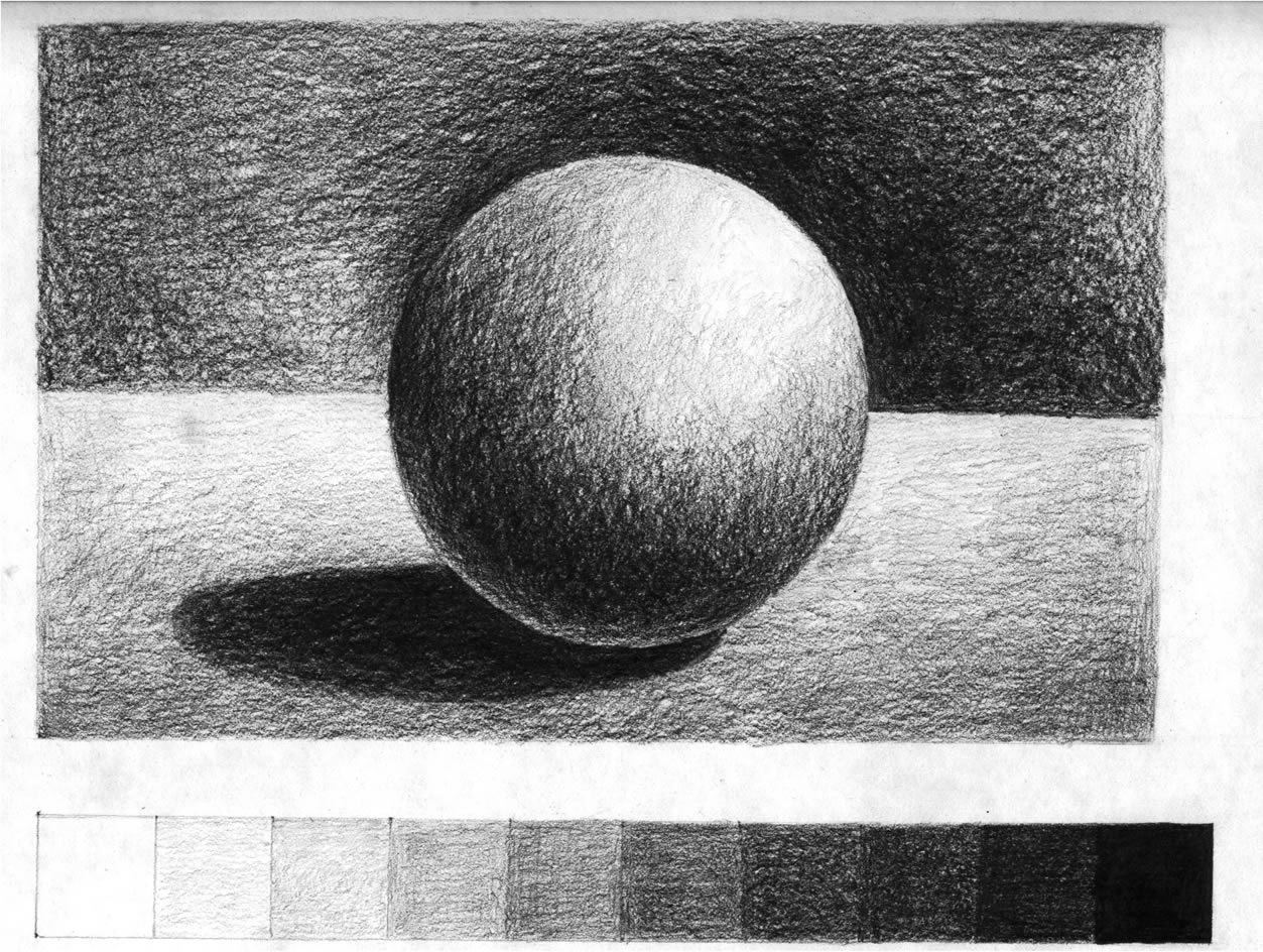
Ball shading

Today we will be working on shading a simple form like a sphere. Without shading, forms often look flat and lifeless. Once you start playing around with shading, things begin to appear more life like. This website has some great directions for getting you started. Today in class we'll watch this video as well. This drawing will be due at the end of class.

Tuesday, September 11, 2012

Watercolor August and September

Let's splatter! Next we'll be building layer upon layer to create value and depth. For this technique please only use one color.

Magazine art inspiration

Today we roll some more... But aren't these cool?

Abstract Expressionist Timelines are due on Monday

We're still working on our timelines, but today's focus is on adding value to your work with colored pencils and ballpoint pen. Tomorrow we'll add more color with watercolors and markers.

Watercolor June and July

Today we'll use the dry on dry technique, and a graduated wash technique.

Monday, September 10, 2012

Magazine Bowls

Today we'll start these magazine bowls...

Adding alcohol and salt to Watercolor

These "fish eyes" are characteristic of the alcohol technique.
These frosty looking shapes are characteristic of salt.
What techniques do you see in this painting? Today: April and May

Friday, September 7, 2012

Outline your pencil lines today

Today finish up your pencil drawing and ink all of your lines. Focus on varying the width of your lines!

Thursday, September 6, 2012

masking fluid for watercolor

This watercolor technique was done using masking fluid.