Showing posts with label Art I. Show all posts

Monday, June 3, 2013

jewelry making!

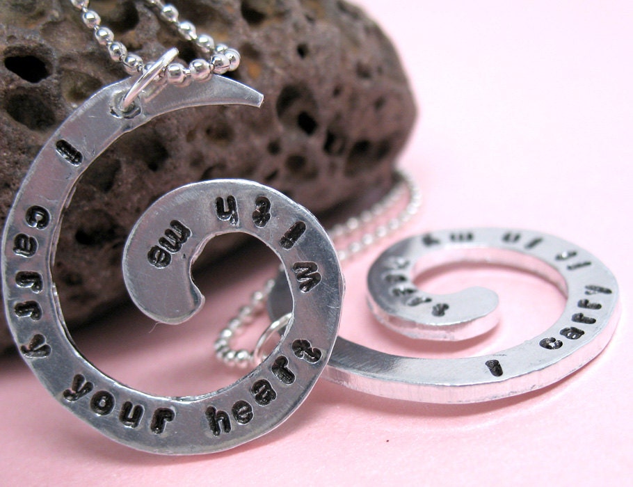
This week we'll be stamping metal pendants, cutting out the metal with a jeweler saw, filing the edges, and polishing them on the buffer.


Thursday, May 16, 2013

Phixr


Today you'll choose a photo of a person that you admire off of the internet.  It (of course) needs to be school appropriate.  You will alter it using phixr.com.  You need to be logged in to your student server in order to save your work in the drop box.  

To change your photo into a high contrast black and white photo:
www.phixr.com
·       Click on the green “get started” arrow
·       Click “no thanks, skip this”
·       Click the gray “browse” button
·       Look in the desktop, click on your file and hit open
·       Click on  “upload the chosen photo to phixr”
·       Click on the sharpen tool and then click the unsharp mask button
·       Click on the color effects tool, and on the pull-down click on “two color” and you can play around with the contrast and brightness until you get something that you like. (Mine were brightness=109 and contrast=7) then hit execute
·       Under the download/save tab pull down jpeg under the file format and hit download/save. 
·       Make sure save is selected on the pop-up and click OK
·       Save in the drop box under your hour:
>downloads
>student shared on Mvc1_student_server/stu
>Irondaledropbox
>cannonj
>your hour
>save


Monday, May 6, 2013

printmaking


Before we start today, we're going to watch a couple of videos on  printmaking.

Inspired by the traditional Tibetan Prayer Flag, we will create a positive wishing flag, which will be carved,printed, and hung by the students.
Here are some traditional flags being flown. A common misconception is that these prayers are being sent to the gods. Instead they are positive wishes that are being shared with the community. We will also be creating positive messages to be shared in much the same way.

First, students will brainstorm ideas for images that communicate a positive wish for either themselves or the world. Students will design a central image for their own flag that represents their wish. Finally they will design a border or frame that surrounds the central image. Students can choose to use all images, but could also add text.

Students will transfer their drawings to linoleum and cut it out based on the safety instructions given in class.

Students will use the printing press to make multiple copies of their wishing flags. (The image that students carve will be reversed when it's printed)

Friday, April 12, 2013

Intro to Surrealism

We're looking at this...and this...

Monday, April 1, 2013

T-shirt Design


Today we are starting to work on our stenciled t-shirts.  Here is a presentation showing the process!  Click on the T-shirt Freezer Paper Power Point presentation. We will also watch a youtube video that shows the process and do a 10 point worksheet.

Sunday, March 10, 2013

Koru Painting Planning

  • .
    A Koru is a curved shape representing a baby fern frond. The Maori culture of New Zealand uses this motif in their artwork.
  • 2.
    The Koru symbolizes new birth and growth. Look at pictures of fern plants ready to unfurl. What shape do the plants make? Compare the ferns to samples of Maori art. Use a colored pencil to practice making Koru on a piece of construction paper.
  • 3.
    To design a Koru painting, use a colored pencil to sketch one large Koru on a piece of construction paper. Draw two smaller Koru on either side of the larger one.

Wednesday, February 27, 2013

Color Wheel Sculptures


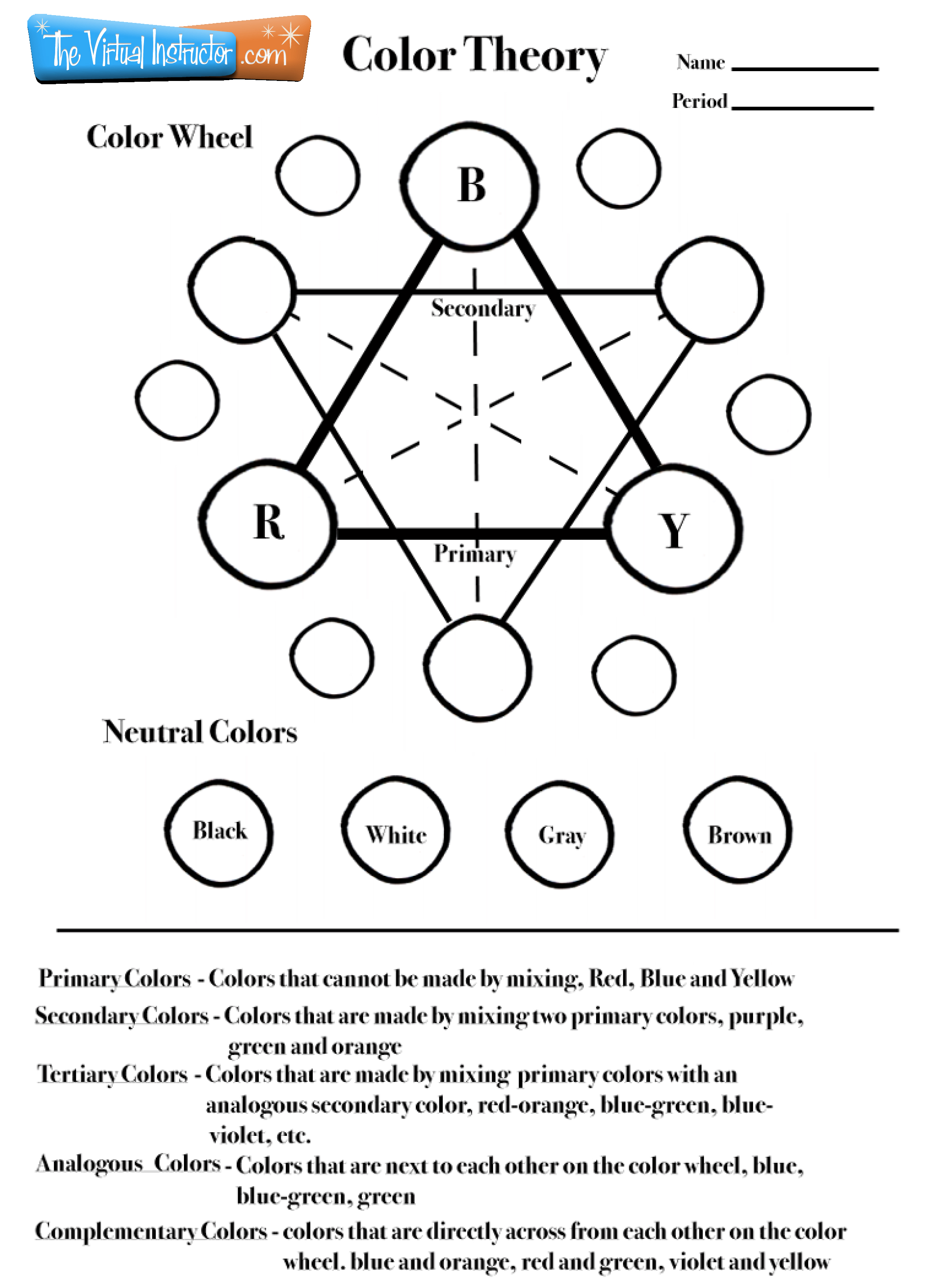
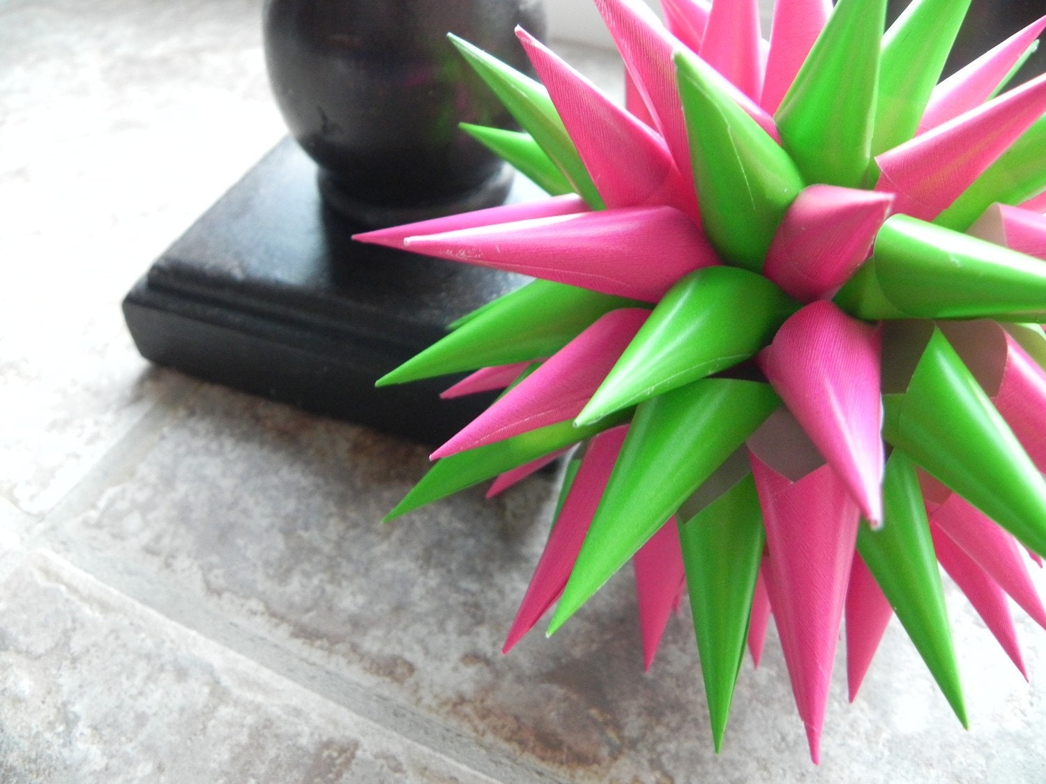
Students have been reviewing primary, secondary and intermediate colors this week and then painting them onto circles.  Today we start cutting them out and making them into 3D star color bursts.  The directions are here.

Mixing the color wheel

Today you will mix the primary colors in order to create all 12 of the colors from the color wheel.

You will need:

paper
a circle to trace 12 x's
paint

Monday, February 25, 2013

COLOR!

Check out this video!

Work with the people in your group to create the 12 colors in the color wheel. Put the colors in order to get your points. Have fun!

Next, you'll work on this worksheet...

Tuesday, February 19, 2013

Value Drawing

We're getting ready to turn in our value drawings on Friday.  I know some of you are getting nervous, so I thought you might like a quick review...  (Notice in the video, he starts with an outline and then hides it within the shading)

Good artwork has:


  • Value
  • Chiaroscuro
  • Crisp edges
  • No outlines (showing)
  • focus (not blurry)

Tuesday, February 12, 2013

Heart Art


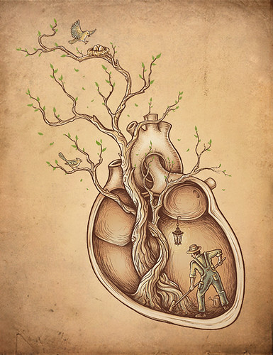
Heart Art.  Just in time for Valentines Day.  To be caught up, you should have you list of 10 things with pictures, along with a rough draft of a heart with your objects arranged inside.  Before you start on the final copy, you should practice using different value techniques with your objects.  Remember:  NO OUTLINES!

Monday, February 11, 2013

Catch up and start planning!


Today you should finish and turn in this ball drawing.  Your focus should be on crisp edges and smooth blending with all smudges erased!


Your final drawing for this unit will include 10 things about you.  Today you can start a list of 10 things and a quick sketch of each of those things drawn realistically.

Thursday, February 7, 2013

Shaded Ball Drawing

Today we will be working on shading a simple form like a sphere. Without shading, forms often look flat and lifeless. Once you start playing around with shading, things begin to appear more life like. This website has some great directions for getting you started. Today in class we'll watch this video as well. This drawing will be due at the end of class.

Tuesday, January 29, 2013

Abstract Timelines


Helen Frankenthaler, Mountains and Sea. 1952. Abstract Expressionism. The painters who came to be called "Abstract Expressionists" shared a similarity of outlook rather than of style-- an outlook characterized by a spirit of revolt and a belief in freedom of expression, and freedom from realism.

For the next week (or so) students will be creating a time line of their lives that will use abstract symbols to represent their 10 most important life events. The finished work will be 2 x 28 inches long and will use ink, colored pencils, glue, collage, paint and anything else we can find around here.

Objectives:
utilizing life experiences as subject matter
communicating in an abstract way Day 1: fold a sheet of paper in 1/2 and number from 1 - 10 on one side. Here you'll list (in order) the important events in your life. When your done listing these, start drawing abstract and unrecognizable symbols for each of your events.


Monday, December 3, 2012

Wishing Flags


Inspired by the traditional Tibetan Prayer Flag, we will create a positive wishing flag, which will be carved,printed, and hung by the students.
Here are some traditional flags being flown. A common misconception is that these prayers are being sent to the gods. Instead they are positive wishes that are being shared with the community. We will also be creating positive messages to be shared in much the same way.

First, students will brainstorm ideas for images that communicate a positive wish for either themselves or the world. Students will design a central image for their own flag that represents their wish. Finally they will design a border or frame that surrounds the central image. Students can choose to use all images, but could also add text.

Students will transfer their drawings to linoleum and cut it out based on the safety instructions given in class.

Students will use the printing press to make multiple copies of their wishing flags. (The image that students carve will be reversed when it's printed)

Friday, November 9, 2012

Clay Totem Pots with a Lid

Today we will be starting the walls and the base of our clay project.  First we'll watch a video on how to throw your slab for the walls and base. 

Monday, October 29, 2012

T-shirt design

Today we are starting to work on our stenciled t-shirts.  Here is a presentation showing the process!  Click on the T-shirt Freezer Paper Power Point presentation. We will also watch a youtube video that shows the process.

Wednesday, October 17, 2012

Final Acrylic Painting

Today you will decide if the color scheme you chose last week is the one you want to use for your final painting.
You need to choose from:
Analogous
Triadic
Complementary
Split-Complementary
Square
Reminders:

  • whichever color scheme you choose, you can add black, white or gray to the colors.  
  • it usually works best to choose one of the colors in your color scheme to focus on and then use the other colors for accents.  
Your assignment starts by repeating shapes or lines with the colors in your color scheme.  Don't let your underpainting show, so use lots of layers.  There will be no white paper showing in the end, so you'll need to fill in the background.  I usually do underpainting on the objects and then underpainting and painting on the background--saving the final coat of paint on the objects for last.  Honestly, this is my personal preference.  I think it's easy.  Make your own path.

Tuesday, October 16, 2012

Basic color schemes


analogous
Analogous color scheme
Analogous color schemes use colors that are next to each other on the color wheel. They usually match well and create serene and comfortable designs.
Analogous color schemes are often found in nature and are harmonious and pleasing to the eye.
Make sure you have enough contrast when choosing an analogous color scheme.
Choose one color to dominate, a second to support. The third color is used (along with black, white or gray) as an accent.

analogous scheme
triadTriadic color scheme 
A triadic color scheme uses colors that are evenly spaced around the color wheel.
Triadic color schemes tend to be quite vibrant, even if you use pale or unsaturated versions of your hues.
To use a triadic harmony successfully, the colors should be carefully balanced - let one color dominate and use the two others for accent.

triadic scheme
split-complementarySplit-Complementary color scheme 
The split-complementary color scheme is a variation of the complementary color scheme. In addition to the base color, it uses the two colors adjacent to its complement.
This color scheme has the same strong visual contrast as the complementary color scheme, but has less tension.
The split-complimentary color scheme is often a good choice for beginners, because it is difficult to mess up.
split-complementary scheme
Rectangle (tetradic) color scheme 
The rectangle or tetradic color scheme uses four colors arranged into two complementary pairs.
This rich color scheme offers plenty of possibilities for variation.
Tetradic color schemes works best if you let one color be dominant.
You should also pay attention to the balance between warm and cool colors in your design.
rectangle scheme
squareSquare color scheme 
The square color scheme is similar to the rectangle, but with all four colors spaced evenly around the color circle.
Square color schemes works best if you let one color be dominant.
You should also pay attention to the balance between warm and cool colors in your design.
square scheme
Complementary colors are really bad for text.

complementary scheme
complementaryComplementary color scheme
Colors that are opposite each other on the color wheel are considered to be complementary colors (example: red and green).
The high contrast of complementary colors creates a vibrant look especially when used at full saturation. This color scheme must be managed well so it is not jarring.
Complementary color schemes are tricky to use in large doses, but work well when you want something to stand out.

Today you'll learn about these different color schemes (and take notes on them) and why it's important to choose one!  Then you'll pick which one you'd like to use for your final painting.  Using your chosen color scheme, you'll paint a quick masterpiece in class today.