Monday, October 29, 2012

T-shirt design

Today we are starting to work on our stenciled t-shirts.  Here is a presentation showing the process!  Click on the T-shirt Freezer Paper Power Point presentation. We will also watch a youtube video that shows the process.

Wednesday, October 17, 2012

Apple Painting


We'll watch this video today. Every time the instructor in the video says to mix the paint with water, substitute slo-dri. We'll talk about that today too.

Underpainting
Building form by adding Layers
Slo-dri

Final Acrylic Painting

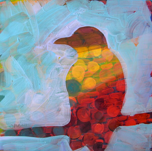
Today you will decide if the color scheme you chose last week is the one you want to use for your final painting.
You need to choose from:
Analogous
Triadic
Complementary
Split-Complementary
Square
Reminders:

  • whichever color scheme you choose, you can add black, white or gray to the colors.  
  • it usually works best to choose one of the colors in your color scheme to focus on and then use the other colors for accents.  
Your assignment starts by repeating shapes or lines with the colors in your color scheme.  Don't let your underpainting show, so use lots of layers.  There will be no white paper showing in the end, so you'll need to fill in the background.  I usually do underpainting on the objects and then underpainting and painting on the background--saving the final coat of paint on the objects for last.  Honestly, this is my personal preference.  I think it's easy.  Make your own path.

Tuesday, October 16, 2012

Basic color schemes


analogous
Analogous color scheme
Analogous color schemes use colors that are next to each other on the color wheel. They usually match well and create serene and comfortable designs.
Analogous color schemes are often found in nature and are harmonious and pleasing to the eye.
Make sure you have enough contrast when choosing an analogous color scheme.
Choose one color to dominate, a second to support. The third color is used (along with black, white or gray) as an accent.

analogous scheme
triadTriadic color scheme 
A triadic color scheme uses colors that are evenly spaced around the color wheel.
Triadic color schemes tend to be quite vibrant, even if you use pale or unsaturated versions of your hues.
To use a triadic harmony successfully, the colors should be carefully balanced - let one color dominate and use the two others for accent.

triadic scheme
split-complementarySplit-Complementary color scheme 
The split-complementary color scheme is a variation of the complementary color scheme. In addition to the base color, it uses the two colors adjacent to its complement.
This color scheme has the same strong visual contrast as the complementary color scheme, but has less tension.
The split-complimentary color scheme is often a good choice for beginners, because it is difficult to mess up.
split-complementary scheme
Rectangle (tetradic) color scheme 
The rectangle or tetradic color scheme uses four colors arranged into two complementary pairs.
This rich color scheme offers plenty of possibilities for variation.
Tetradic color schemes works best if you let one color be dominant.
You should also pay attention to the balance between warm and cool colors in your design.
rectangle scheme
squareSquare color scheme 
The square color scheme is similar to the rectangle, but with all four colors spaced evenly around the color circle.
Square color schemes works best if you let one color be dominant.
You should also pay attention to the balance between warm and cool colors in your design.
square scheme
Complementary colors are really bad for text.

complementary scheme
complementaryComplementary color scheme
Colors that are opposite each other on the color wheel are considered to be complementary colors (example: red and green).
The high contrast of complementary colors creates a vibrant look especially when used at full saturation. This color scheme must be managed well so it is not jarring.
Complementary color schemes are tricky to use in large doses, but work well when you want something to stand out.

Today you'll learn about these different color schemes (and take notes on them) and why it's important to choose one!  Then you'll pick which one you'd like to use for your final painting.  Using your chosen color scheme, you'll paint a quick masterpiece in class today.

Making browns

Students have been experimenting with complimentary colors in order to make mustaches on a stick with a variety of browns.  Our focus is on covering underpainting, recognizing complimentary colors, and working with a variety of brush sizes.  Due today.

color wheel mandala

Students are mixing color wheel mandalas, and are expected to include the true color, a tint, a shade, and also mixed with its compliment.  Due on Wednesday.

Thursday, October 4, 2012

Acrylic Inspiration


color wheel reminder


Papier Mache

I can't imagine working with papier mache without thinking of the festive skulls that are made to celebrate Day of the Dead in Mexico on November 1st.  While there are lots of interpretations of the holiday, I like to think of it as people both celebrating life and the lives of those who aren't still alive.

Wednesday, October 3, 2012

paper mache

For this assignment students are making animal masks, sculpture or taxidermy-like creations mounted on plaques.  The focus is on making a sturdy creation, that is imaginative and well done.

Final Watercolor Painting is due on Monday

Students are still working on their watercolor paintings.  There are so many awesome pieces of artwork in my room right now.  This is the first one completed.  Students need to choose 5 of the techniques learned earlier in the semester that would compliment their work. 

Acrylic Painting

This is what direction we'll go after our starbursts are completed.  Intermediate colors in the first coat.  Tints OR shades in the foreground.

Monday, October 1, 2012

Check out this video!

Work with the people in your group to create the 12 colors in the color wheel. Put the colors in order to get your points. Have fun!